
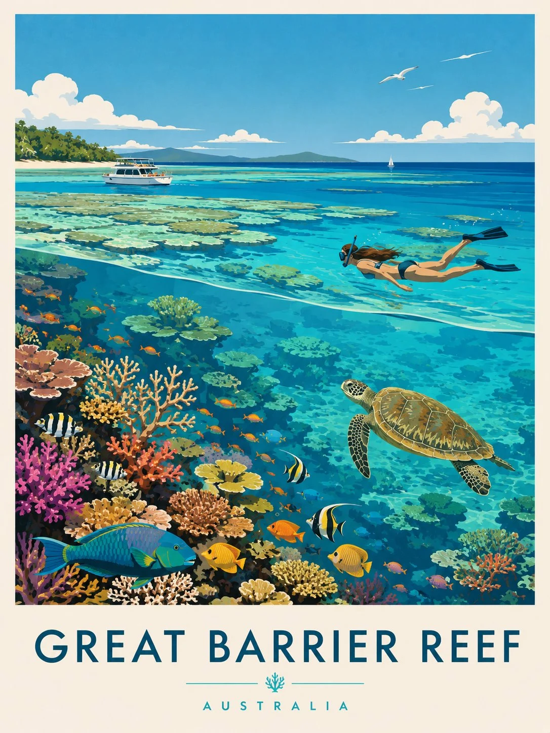
Great Barrier Reef retro travel poster
Create a premium editorial travel poster illustration of the Great Barrier Reef, Australia. Style: Flat vector illustration, ultra-clean minimalism, mid-century modern travel poster aesthetic, inspired by vintage tourism
AI-generated demonstration · #432 · Posters & Editorial · 16/9
Prompt
Create a premium editorial travel poster illustration of the Great Barrier Reef, Australia.
Style: Flat vector illustration, ultra-clean minimalism, mid-century modern travel poster aesthetic, inspired by vintage tourism prints and Scandinavian graphic design. No photorealism, no textures, no noise, no gradients. Use crisp shapes, smooth color blocks, and harmonious vibrant tones.
Composition (vertical 3:4 layout):
Foreground (underwater): A rich coral reef ecosystem filled with colorful corals in pink, orange, yellow, and red tones. Include tropical fish of various species (striped, bright yellow, blue, and orange), and a large sea turtle swimming gracefully toward the right. Clear turquoise water with high visibility.
Midground: A female snorkeler swimming horizontally just beneath the water surface, wearing fins and a snorkel mask, observing the reef below. Light rays subtly pass through the water surface.
Background (above water): A calm tropical ocean with shallow reef patches visible through crystal-clear water. A white leisure boat floats peacefully on the left, and a small sailboat appears far in the distance. On the horizon, soft green islands or hills stretch across.
Sky: Bright blue sky with fluffy white clouds and a few birds flying, enhancing the serene vacation mood.
Typography:
At the bottom of the poster, include bold uppercase text:
“GREAT BARRIER REEF”
Below it, smaller spaced-out text:
“AUSTRALIA”
Add a small decorative coral icon between divider lines.
Mood & Lighting: Bright daylight, calm, inviting, tropical paradise atmosphere. Colors should feel fresh, vibrant, and relaxing with strong contrast between coral reef and ocean blues.
Style Breakdown
Separate the main visual, headline area, and supporting information into a clear hierarchy. Describe light direction and a limited palette to connect those layers.
Recommended Parameters / Aspect Ratio
Start with the template aspect ratio 16/9 to preserve the demonstrated framing. Use a standard preview resolution first, then increase output size after the composition works. Model-specific steps and guidance values are not supplied for this example; use your selected provider's defaults and adjust one setting at a time. Results vary between models.
Review Your Result
Inspect margins, letter shapes, and the visual balance between filled areas and empty space. Typeset final copy separately when exact wording matters.
Use Case Scenarios
Use this approach for concept posters, event direction boards, or publication layouts. Replace sample copy with your own and verify all claims before release.
Templates demonstrate visual techniques. They are not evidence of real events or endorsements. Use fictional subjects and authorized materials. Report concerns to [email protected].