
City names and landmarks typography travel poster
Create a clean, modern typographic travel poster where the city name itself becomes the composition. Render the city name in large, bold, uppercase sans-serif letters spanning the width of the artwork. Seamlessly integra
AI-generated demonstration · #511 · Posters & Editorial · 16/9
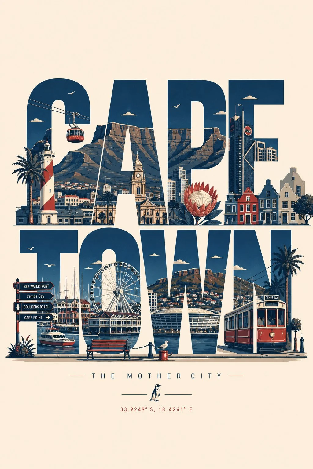
Prompt
Create a clean, modern typographic travel poster where the city name itself becomes the composition. Render the city name in large, bold, uppercase sans-serif letters spanning the width of the artwork. Seamlessly integrate the city's most iconic landmarks, architecture, monuments, streets, transportation, cultural symbols, cafés, bridges, parks, skylines, sculptures, waterfronts, historic buildings, and local details into, around, and inside the letters. Let landmarks naturally interact with the typography while preserving legibility.
Use an elegant flat vector illustration style with crisp geometric shapes, minimal detail, clean outlines, subtle shadows, and a premium editorial aesthetic. Maintain a limited color palette of deep navy, warm cream, muted red, and soft gray-blue for a timeless travel-poster look.
Add small decorative elements such as street lamps, trees, clouds, birds, benches, bicycles, fountains, trams, ferries, or other city-specific objects where appropriate. Keep generous negative space with a clean background and perfectly balanced composition.
Ensure every landmark, architectural style, vehicle, sign, and cultural element is accurate to the chosen city—avoid generic or incorrect landmarks. If desired, include a small elegant tagline beneath the city name (such as a famous nickname or slogan) in minimal typography.
Style: premium flat vector, minimalist travel poster, geometric illustration, editorial design, tourism branding, clean typography, high contrast, ultra-sharp lines, museum-quality print, modern graphic design, centered composition, scalable SVG aesthetic, 8K resolution.
Style Breakdown
Separate the main visual, headline area, and supporting information into a clear hierarchy. Describe light direction and a limited palette to connect those layers.
Recommended Parameters / Aspect Ratio
Start with the template aspect ratio 16/9 to preserve the demonstrated framing. Use a standard preview resolution first, then increase output size after the composition works. Model-specific steps and guidance values are not supplied for this example; use your selected provider's defaults and adjust one setting at a time. Results vary between models.
Review Your Result
Inspect margins, letter shapes, and the visual balance between filled areas and empty space. Typeset final copy separately when exact wording matters.
Use Case Scenarios
Use this approach for concept posters, event direction boards, or publication layouts. Replace sample copy with your own and verify all claims before release.
Templates demonstrate visual techniques. They are not evidence of real events or endorsements. Use fictional subjects and authorized materials. Report concerns to [email protected].