type
{ "type": "VTuber stream thumbnail", "character": { "hair": "long blonde twin tails with pink gradient ends", "eyes": "large pink anime eyes", "expression": "cheerful smile with a small fang, making a pea
AI-generated demonstration · #096 · UI & UX Design · 16/9
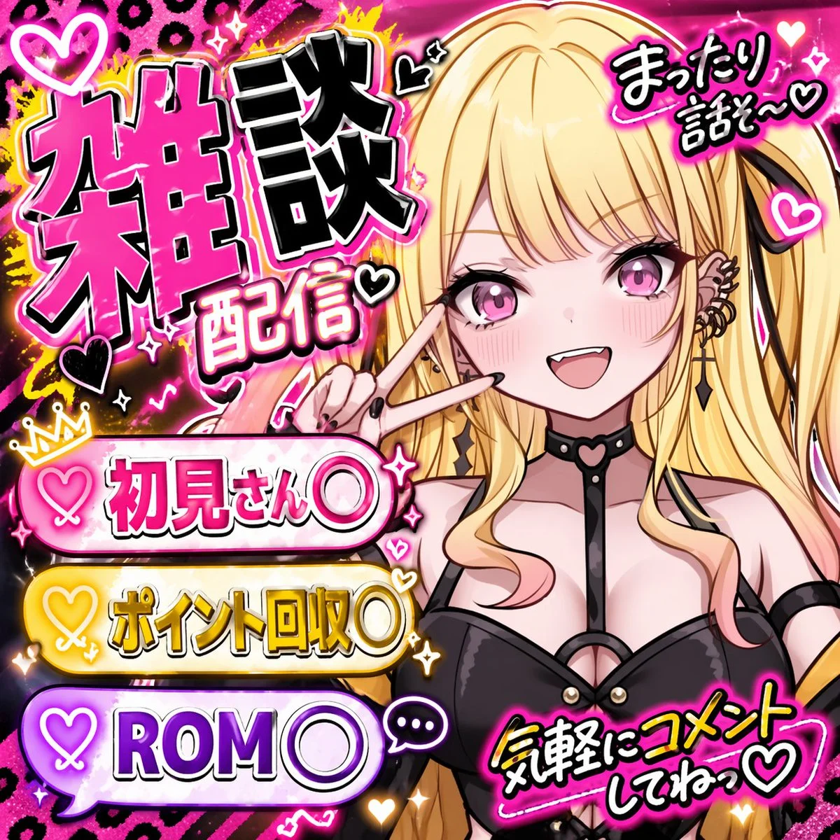
Prompt
{
  "type": "VTuber stream thumbnail",
  "character": {
    "hair": "long blonde twin tails with pink gradient ends",
    "eyes": "large pink anime eyes",
    "expression": "cheerful smile with a small fang, making a peace sign near the eye",
    "outfit": "black top with harness straps, black heart-ring choker, multiple ear piercings including a cross dangle, black nail polish"
  },
  "background": "vibrant neon pink and black leopard print with glowing yellow accents, sparkles, and floating hearts",
  "typography_and_layout": {
    "main_title": {
      "position": "top left",
      "style": "large, bold, 3D, pink and black with white outlines",
      "text": "{argument name=\"main title\" default=\"雑談配信\"}"
    },
    "top_right_text": {
      "style": "casual handwritten style with a heart",
      "text": "{argument name=\"top right text\" default=\"まったり話そ〜♡\"}"
    },
    "bottom_left_banners": {
      "count": 3,
      "style": "glowing pill-shaped banners with heart icons on the left",
      "colors": ["pink", "yellow", "purple"],
      "labels": [
        "{argument name=\"banner 1 text\" default=\"初見さん〇\"}",
        "{argument name=\"banner 2 text\" default=\"ポイント回収〇\"}",
        "{argument name=\"banner 3 text\" default=\"ROM〇\"}"
      ]
    },
    "bottom_right_text": {
      "style": "casual handwritten style with a heart, yellow text with pink outline",
      "text": "気軽にコメントしてねっ♡"
    }
  }
}
Style Breakdown
Use spacing, type scale, and a clear primary action to establish hierarchy. Keep labels short and use invented account names and neutral navigation.
Recommended Parameters / Aspect Ratio
Start with the template aspect ratio 16/9 to preserve the demonstrated framing. Use a standard preview resolution first, then increase output size after the composition works. Model-specific steps and guidance values are not supplied for this example; use your selected provider's defaults and adjust one setting at a time. Results vary between models.
Review Your Result
Review button alignment, text legibility, and repeated component spacing at full size. A generated interface is a visual concept, not working software.
Use Case Scenarios
Use this exercise for early wireframe discussions or visual direction boards. Rebuild the approved layout in accessible HTML before testing it with users.
Templates demonstrate visual techniques. They are not evidence of real events or endorsements. Use fictional subjects and authorized materials. Report concerns to [email protected].